Sherwin Williams Pure White is a popular off-white paint color for kitchen cabinets, main interior walls, trims, ceiling, or exterior applications. If you want your home to feel clean, crisp, light, and airy without a pronounced yellow undertone, then SW Pure White is the perfect off-white paint color. The two biggest mistakes people make when painting their home with SW Pure White is not considering how SW Pure White will pair with the type of lighting and fixed elements they have in their home.
I want to help you understand the undertone of SW Pure White by comparing it to other off-whites so you can see for yourself why it's a warm off-white, explaining the different circumstances of how lighting can influence Sherwin Williams Pure White in your home, and explaining why fixed elements will play a key role in determining if Sherwin Williams Pure is the right paint to pair with what you have in your home.

Often, many people are influenced by what they see or read online about SW Pure White. We are so inundated with opinions, pictures, and videos that it's easy to be influenced by what we see or hear. My focus on paint colors is simple. Identify the undertone. Get a real paint sample that is not color-matched. Compare SW Pure White with your fixed elements and understand why lighting will influence how SW Pure White can look in your home. I want to help you understand the basics so you can hopefully decide if SW Pure White is the right paint color for your home.
If you want a good visual of the paint colors, I recommend watching the video below or keep reading.
What are the undertones of Sherwin Williams Pure White 7005?
The first step you should always take, regardless of the paint color, is to identify the undertones of a paint color. This is important for many reasons because the undertone will reveal itself depending on what colors you pair it with. Identifying the undertone is not the answer to selecting the right off-white paint color for your home because your fixed elements, interior decor, and the type of lighting you have in your home will have a bigger role in selecting the correct paint color for your home. I will talk about the fixed elements and lighting in a few minutes.

I want you to see the undertone of Sherwin Williams Pure White and to see why it's not a bright white, not a true off-white, or too warm. The best approach to understanding SW Pure White is by comparing it to other off-white paint colors. I'm going to compare SW Pure White with SW High Reflective White, SW Greek Villa, and SW White Snow to help you understand what makes SW Pure White unique in its own way.
Comparing Sherwin Williams Pure White 7005 to Sherwin Williams High Reflective White 7757
I want you to see the undertone yourself, so watch what happens when I compare Sherwin Williams Pure White to Sherwin Williams High Reflective White. By the way, SW High Reflective White is a true off-white, which means it's not cool or warm. Notice how SW Pure White is muted, and you can see a touch of yellow in comparison to SW High Reflective White, which is a bright and clean off-white paint color.
The touch of yellow undertone makes Sherwin Williams Pure White a warm off-white paint color. Yes, it's a warm off-white, but it can look cooler than it is, depending on what color or paint color you compare it to. That's why I always say to compare a color to see what it looks like in your home or space.

Comparing Sherwin Williams Pure White 7005 to Sherwin Williams Greek Villa 7551
Next, I want to show you what happens when I compare SW Greek Villa, a warm off-white. You can quickly notice how SW Greek Villa is warmer and has a pronounced yellow undertone when paired with SW Pure White, which is lighter and brighter than SW Greek Villa.
If you were to paint half of your wall with SW Greek Villa and the other half with SW Pure White you will notice how SW Pure White almost looks like a true off-white as SW Greek Villa will look creamier than it really is. This is a great example of how paint colors can reveal their undertones depending on what you compare them to. I can go in great depth talking about either one of these paint colors when paired with other colors but the key focus here is that SW Pure White is not considered a very warm off-white paint color.

Comparing Sherwin Williams Pure White 7005 to Sherwin Williams White Snow 9541
SW White Snow is a relatively new paint color in the Sherwin-Williams Emerald Designer Edition. It's been a trending paint color for a while as it's a slightly different off-white than the standard off-whites you find in Sherwin Williams. I don't use it often, but in the right circumstances, you can utilize this beautiful off-white.
When you compare SW White Snow with SW Pure White, you can see how SW White Snow is clean, lighter, and brighter. It almost looks like a true off-white; however, it does have a touch of yellow undertone. SW Pure White looks muted and much warmer than SW White Snow.
Now you know that Sherwin Williams is a warm off-white and has a touch of yellow undertone, but it's not too warm, and it's definitely not a true off-white despite this paint color name.

How Lighting Can Influence Sherwin Williams Pure White
Many people miss the mark on selecting the right off-white for their home because the lighting influences how it looks in their home, and often, it's a costly mistake that could have been avoided. Natural lighting and artificial lighting are equally important. When I'm helping my online client, I can instantly tell which off-whites will or will not work in their home depending on it's for a trim, ceiling, interior doors, main interior walls, and exterior application (exterior off-whites is a different ordeal as the off-whites are four times brighter).
When it comes to natural lighting, and you are thinking about painting your trims, interior doors, and ceilings, it's not complicated for the most part as long as the off-white trim paint color is compared correctly with the fixed elements. However, if you're thinking about painting the main interior walls of your home with SW Pure White, this is where it gets critical to get it right.

For example, if your entryway doesn't receive a lot of natural lighting, the interior design is angled, and there is not a lot of natural light reflection on the walls, don't be surprised to see SW Pure White look dingy and cold. Sometimes, you may see a slight blue cast on the interior walls (check out the video as I show you a great example of what I'm talking about).
The type of artificial lighting you have in your home will influence how SW Pure White looks. The temperature of your artificial lighting can also affect the ambiance of your space or home. I can go into great detail on this topic, but I want you to get a glimpse of what I'm talking about, as I want to help lead you in the right direction.
Let's say you're building a new home, you can only customize your options based on the builder's choices, regardless you're excited and you've always wanted the off-white look, think farm house. You painted the main interior walls with SW Pure White, the cabinets are white oak, the flooring is different shades of white oak, and the builder installed 5,000K lighting.
When you move into your new home and settle in after a few weeks, you start to notice how the interior walls throughout your home look sterile and feel cold, and you see a blue cast on your walls. I see this happen all the time, I help so many clients with new builds not happy with the off-white paint color selected. Often, it's the interior design layout of the home, the fixed elements, the spacing of artificial lighting, and not receiving a decent amount of natural lighting. In this case, you need to go with either a warmer off-white, or it can be as simple as changing the artificial lighting in your home to 3,500K to 4,000K.
Watch out for the undertones of your fixed elements!
As you know, the first step is to identify the undertone, which you know is SW Pure White, a warm off-white. The second step is to identify the undertones in your home and outside of it. It's important that you get this right, as this will help you decide what paint colors will or will not work in your home.
Often, many people become too focused on what they have in their homes and not paying attention to what undertones they have outside of their homes. If you're thinking about painting SW Pure White as a main interior wall paint color in your home then this topic will be of great benefit for you.
Always look outside your windows and observe your natural surroundings. Do you have a fence that is stained in red (it could be brown red, etc.) or a red brick home? Then don't be surprised if you see a slight pink undertone on the interior of your walls due to the reflection from the windows. Do you have trees, and what type of tree or foliage do you have outside of your home? Don't be surprised if the interior walls look green, etc.

What about your windows, are they tinted? If you have blue-tinted windows, expect SW Pure White to look cold and dingy and will cast a blue shade on the interior of your walls. If you have green-tinted windows, expect SW Pure White to cast a green shade on the interior of your walls. You need to go with warmer neutrals if your windows are tinted blue or green and the same is true if you have a lot of trees or exterior fixed elements outside of your home. Off-white main interior walls are notorious for reflecting undertones outside and inside of your home.
The same is true for the fixed elements you have inside of your home. I will give you a classic example that I see people do all the time.
Let's say you're planning on selling your home soon; you know the house is outdated with fixed elements that were installed well over a decade ago, the kitchen is dark, and you want to brighten up the kitchen, leave the kitchen countertops as is including the kitchen backsplash but paint the kitchen cabinets. You paint the kitchen cabinets with SW Pure White as it's a popular thing to do, you're excited about the transformation but something just looks off after the painting project was completed.

Turns out the kitchen cabinet has taupe, cream, beige, and some light orange cream undertones. SW Pure White looks like a stark off-white and the kitchen countertops look old and outdated. SW Pure White is too clean and too light to pair with an earthy kitchen countertop. Instead the kitchen cabinets should have been painted with a warmer neutral (watch video, I show you a warmer neutral for warmer kitchen countertops) like SW Ivory Lace.
Please be mindful of your fixed elements on the interior and exterior of your home before deciding if SW Pure White is the correct paint color for it.
Get The Right Paint Color The First Time
If you want to save time, tired of second-guessing, and want to avoid a costly,y mistake, I recommend checking out any of my online packages. I can help you select the right paint colors that will match your fixed and furnished elements, including the type of lighting in your home for the interior or exterior. When you book the appointment to speak with me, you will only speak with me, no one else, and I will tell you what will or will not work at home. The following morning, you will receive a detailed Colro Kit telling you everything you need to know, and you will have the confidence that every paint color recommended will work in your home regardless of which paint color you select.
Go to the FAQ page to see when you can book an appointment with me and learn other valuable facts that will help you understand how I can help you. I would love to help you!
Next, I'm going to share a few fun paint colors that pair beautifully with SW Pure White.
Check out how SW Pure White contrasts with Oranges and Grays
SW Pure White is a versatile off-white paint color that can pair with many different neutrals, jewel tones, moody, dramatic, and calming paint colors, to name a few. The possibilities are unlimited in what you can do with SW Pure White as it doesn't have to be boring or like the current trend of farmhouse whites. Depending on the ambiance and mood a client wants to create in a space, sometimes I like to use off-whites, SW Pure White, for example, to create a contrast with the other fixed elements in a space. I will share a few examples, but to be honest, I've gone far more creative than the paint colors below. Someday I would like to have a paint color review about how to create a cohesive color palette with moody paint colors only. Until then here are some brief ideas for you.
Dark charcoal shades can create a kitchen that is elegant and innovative when paired correctly. For example, you paint the upper kitchen cabinets SW Pure White and lower kitchen cabinets, kitchen island, and kitchen interior wall with BM Wrought Iron.

Another approach is to paint the upper floating kitchen shelves and kitchen accent wall with SW Iron Ore. Paint the kitchen cabinets with SW Pure White.

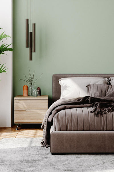
Maybe you own a bed and breakfast at a ski resort, you have hardwood floors or orange-beige window trims, and you want the guest bedroom to attract target clients who are looking for a place to stay during their winter break. You want to create an energizing and warm ambiance for the guest bedroom yet clean and refined. Try going with a muted orange from Sherwin Williams called Caven Clay 7701. Paint the accent wall behind the headboard and repeat the same accent wall for the interior door.

Or maybe you want to repaint your bedroom with a soothing, calming, and rejuvenating paint color that pairs beautifully with linen, oatmeal, creams, grays, blues, and off-white fabrics. Try out Benjamin Moore Beach Glass 1564 as the main interior wall paint color and paint the ceiling, trims, and interior door with SW Pure White.

If you're looking a cool off-white then check out this video paint color review: Sherwin Williams Snowbound Paint Color Review.
Are you looking for a warmer off-white than SW Pure White? I recommend watching this video paint color review: Sherwin Williams Alabaster Paint Color Review.
I recommend watching this video paint color review if you're looking for a soft true off-white: Benjamin Moore Chantilly Lace Paint Color Review.
If you're looking for a warm off-white that is lighter than SW Alabaster I recommend this paint color review called: Benjamin Moore Simply White Paint Color Review.
I hope you found this helpful. I want you to get it right the first time. Please take your time, get a paint sample, compare SW Pure White with your fixed and furnished elements, and observe how your lighting will influence this paint color in your home.
]]>